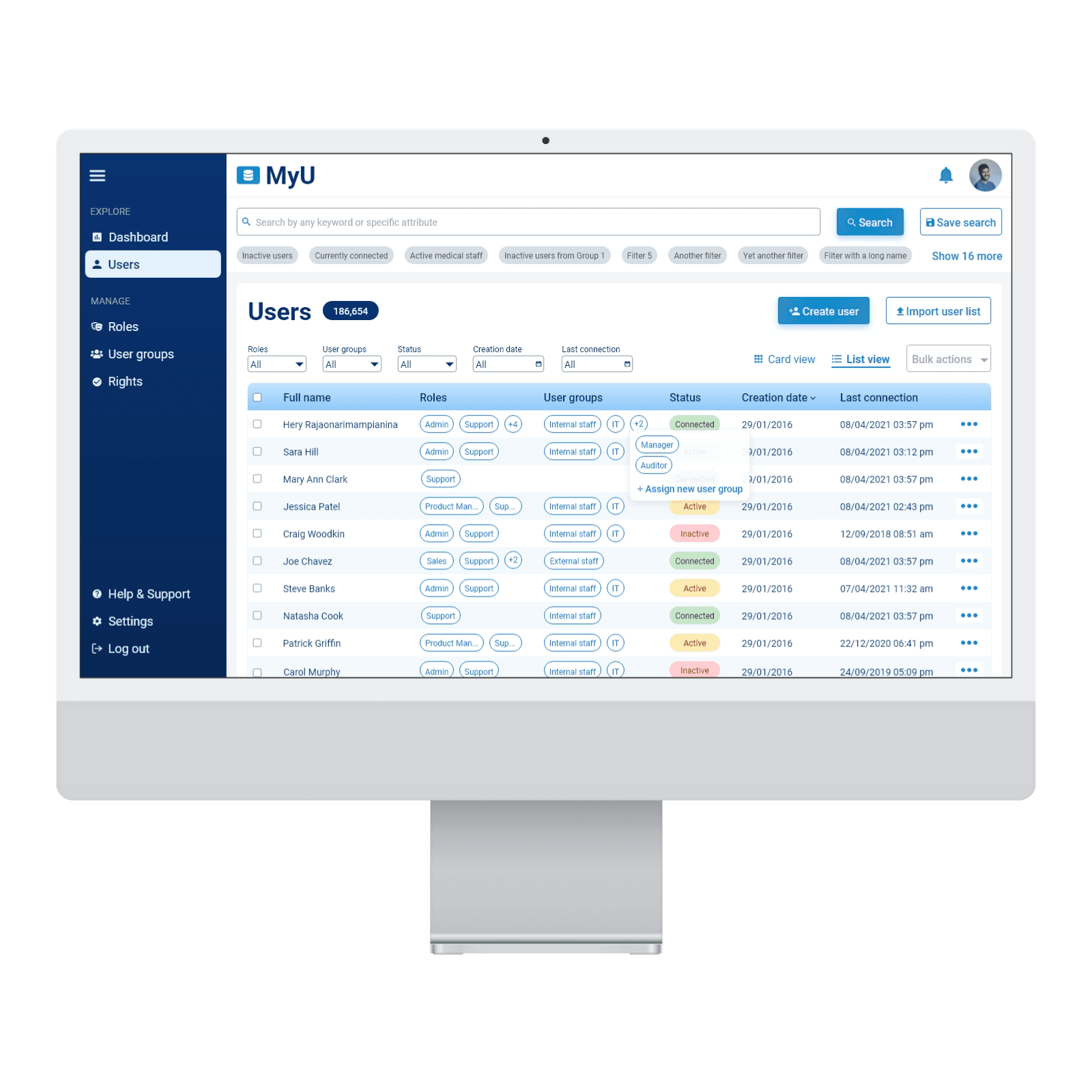
Meta Policy Dashboard
UX Research
UX Design
How I transformed a frustrating dashboard into an intuitive, user-friendly platform, boosting user engagement by 76%

Project overview
As part of a comprehensive UX research initiative, I collaborated closely with Meta personnel to address critical usability challenges with the META Policy Dashboard. This platform provides essential policy research data and custom reports vital for effective internal communication and informed decision-making. However, users consistently reported frustration and inefficiencies that hindered their productivity and satisfaction.
Problem statement
I discovered that Meta users were struggling significantly with the dashboard’s complexity. Key issues included overwhelming interfaces, difficulties in quickly locating relevant talking points, complicated custom report generation, and inadequate sharing functionalities. These challenges were leading to frustration, poor user experiences, and decreased overall engagement.
Goals and objectives
My primary goal was to uncover actionable insights and craft clear, user-driven solutions that would dramatically enhance the dashboard. Specifically, I aimed to streamline navigation, simplify access to critical features, and improve the ease of creating and sharing custom reports.
UX Research approach
To deeply understand users’ challenges and needs, I structured my research into two phases:
Phase 1: User Interviews & Surveys
Conducted five one-on-one interviews with three regular users and two admin users to gather rich qualitative feedback.
Launched a user survey to quantify user satisfaction and validate insights gathered from interviews.
Phase 2: Focus Group Workshops
Led three interactive focus groups to collaboratively brainstorm and prioritize user-focused feature improvements.
Key Findings
During interviews and surveys, I uncovered some critical insights:
Users described the homepage as confusing and cluttered.
Finding relevant talking points was an overwhelming experience due to an excessively long and unorganized list.
Creating custom collateral reports was unintuitive and unnecessarily complex.
Admin users frequently faced unclear labeling and limited exporting options in the Site Analytics feature.
Pain Points Prioritized
Through interactive workshops, I prioritized key usability challenges based on user input, highlighting these essential red routes:
1.
Searching for Talking Points: Users frequently felt overwhelmed due to an extensive and unstructured list of talking points.
2.
Creating Custom Collateral: Users struggled with the unintuitive design and were often unaware of available customization features.
3.
Homepage Ineffectiveness: The homepage failed to immediately communicate value or guide users effectively.
Admin users emphasized significant issues with the quality and accessibility of usage data and the absence of straightforward data export capabilities.
Proposed UX Solutions
With the collaborative insights gained from the focus groups, I proposed several actionable improvements:
Structured Talking Points: Created a clear thematic hierarchy and introduced color-coded categorization to simplify navigation.
Homepage Redesign: Developed a user-friendly search interface placed prominently on the homepage to help users immediately start their tasks.
Improved Custom Collateral Experience: Designed intuitive report templates, developed short instructional videos, and improved iconography to clarify available customization options.
Direct Sharing Capability: Proposed an in-dashboard sharing feature through shareable links, significantly reducing reliance on external email communications.
Enhanced Admin Data Export: Introduced global filters and a robust export function within the Site Analytics section for improved usability and data handling.
Impact
A year after implementing these research-driven recommendations, Meta observed a remarkable 76% increase in dashboard engagement. The streamlined interface and simplified workflows significantly boosted user efficiency, satisfaction, and overall productivity.


