Minterpedissa
UX Design
UI Design
Web Design
A school management system to help improve communication between the teachers, the students and their parents
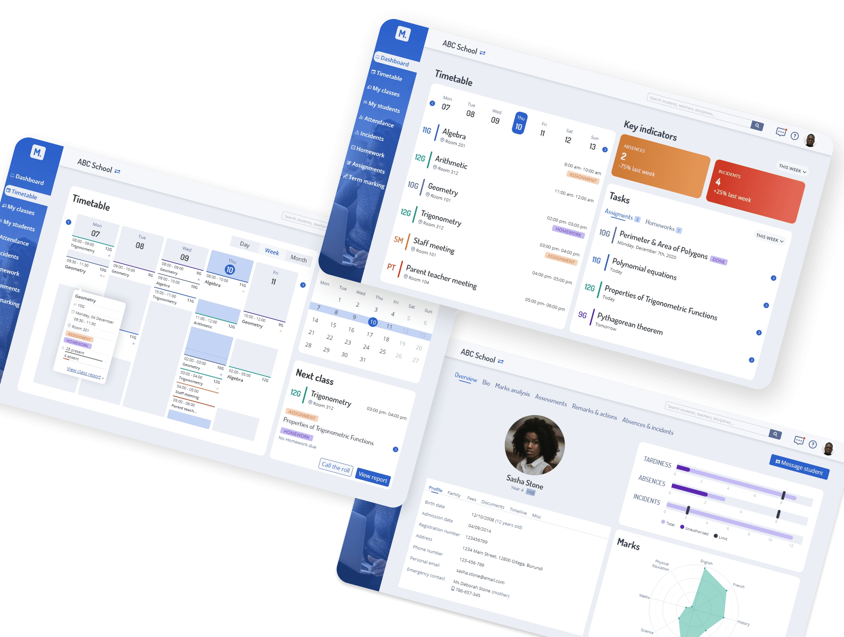
A tool to improve the education system in Africa
In 2020, I volunteered with the UN online volunteers program and work on the design of a responsive web-based school management system to be deployed among the schools of Burundi.
Currently, the school education system there is still mostly handled through manual processes and this platform represents an innovative and effective school and learning management software to offer a modern and digital approach to education in Africa.
The main goals for this tool are:
Improving the quality of education provided to students
Improving communication between students, teachers and parents
Helping educators and parents best understand how to help children grow
Empower educators with more time and better data to enhance whatever style of learning they deem best for their students
My role in the project
I was involved in this project as a UX Designer within a team of 3 to 4 other volunteer designers.
My role mainly includes UX and UI design.
Regarding the research phase, most of the work already had been conducted before I joined the project. I only have been involved to organize the data from the user interviews and formalize the outcomes.
Three different personas with very distinct goals
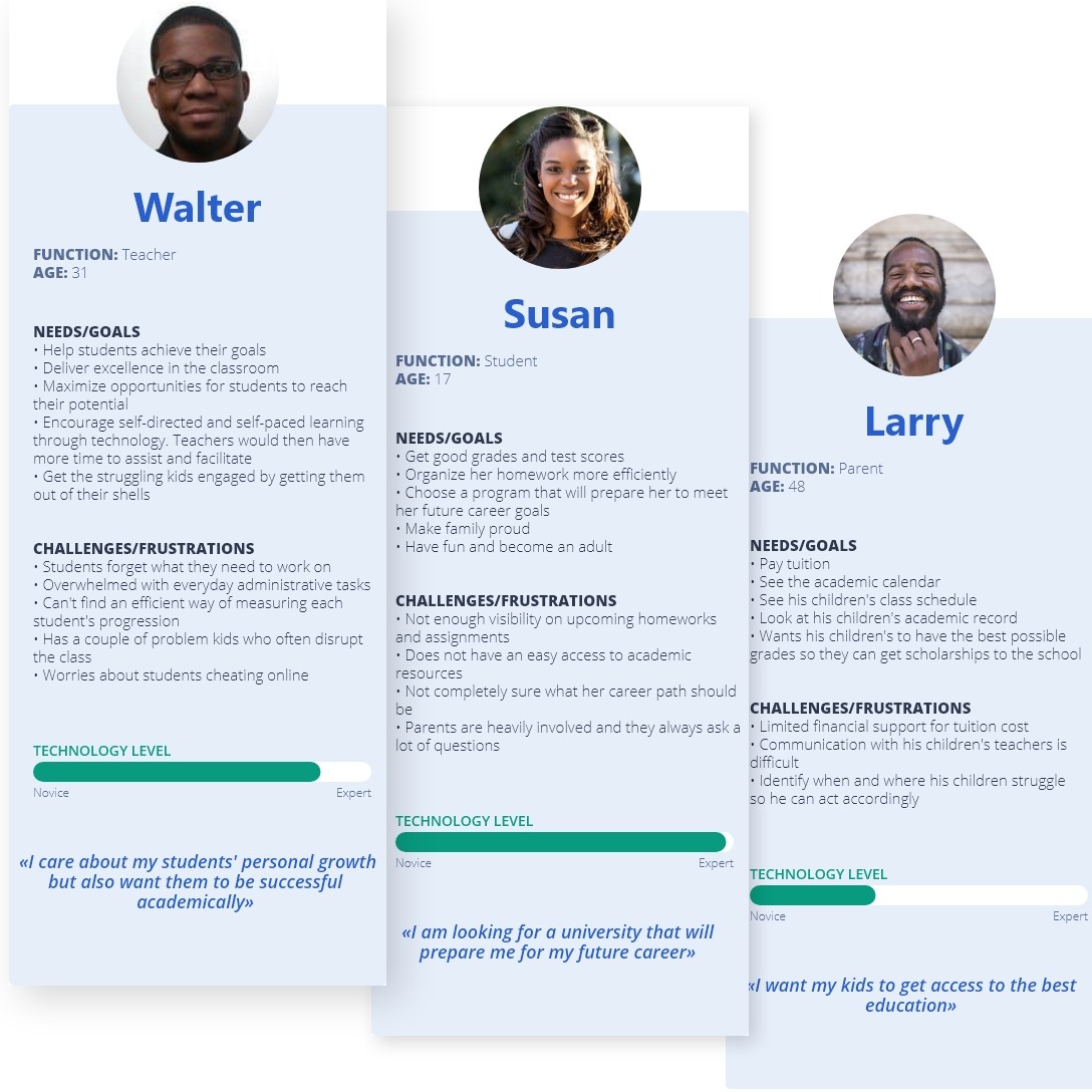
I started the project by going through the project constraints and needs, running competitive analysis, as well as synthesizing 3 primary personas.
The teacher
The student
The parent
The main problems that appear among all personas include :
Difficulty to identify where the student is struggling and point out solutions to help and support him
Lack of follow-up and communication
Lack of visibility regarding schedule, homeworks and assignments
Overwhelming and time-consuming administrative tasks
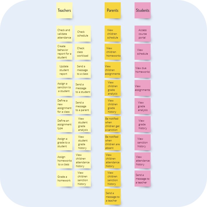
Based on the outcome of the research phase, we defined an MVP to improve :
visibility on schedule, due homeworks, upcoming tests and student performance
communication between teachers, students and parents
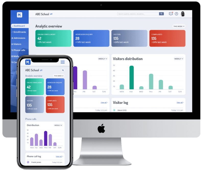
In order to address these 2 problems, we decided to design a dashboard (1 for each persona) which will enable the users to have an easy overview of the latest relevant information and immediate access to all of the relevant parts of the application.
Also, we decided that each student should have a profile page (that can be easily accessed by both teachers and parents) that would group all the important information, including:
Identity and emergency contact
Attendance, lateness and sanctions
Detailed data and analysis on the grades obtained in all classes
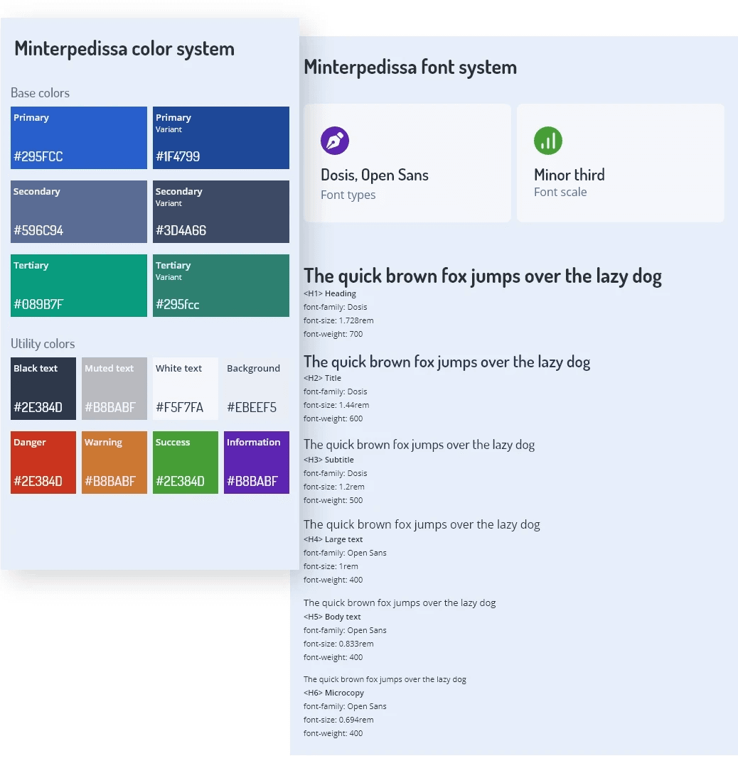
The deliverables include a UI style guide and a high-fidelity prototype.
I designed both color and font systems to provide a trustworthy yet attractive visual identity to the application. In addition, all colors, font types, sizes, weigths and combination of colors and font types have been chosen so that the application follows the standards of WCAG 2.0 for web acessibility.
Once the color scheme and typography were in place, the elements were put together and a high-fidelity prototype supporting main user flows was created.
Need a better understanding of users
This case study presents the work I have done during my 2 months on the project.
Although some user research had been conducted before I joined the project, I felt during the design phase that we were lacking information and we needed to take a lot of assumptions that have not been confirmed.
It would be necessary to refine the personas and build consistent user journeys. Here’s a list of potential next steps :
Breakdown the "Student" persona according to the school and age : K-12, highschool, college or university. The goals and challenges faced by the students will be totally different according to their current level of education and we need to take this into account in the design.
Same goes for parents and teachers
Develop the "School administration" persona who will manage the admission process, enrollments, tuitions, scholarships, etc.
Start conducting user tests on prototypes
